Finding the Pulse: The Best Technical Macro Indicators for Professional Trading
A strategic bridge between the visual precision of technical analysis and the structural weight of global economics.
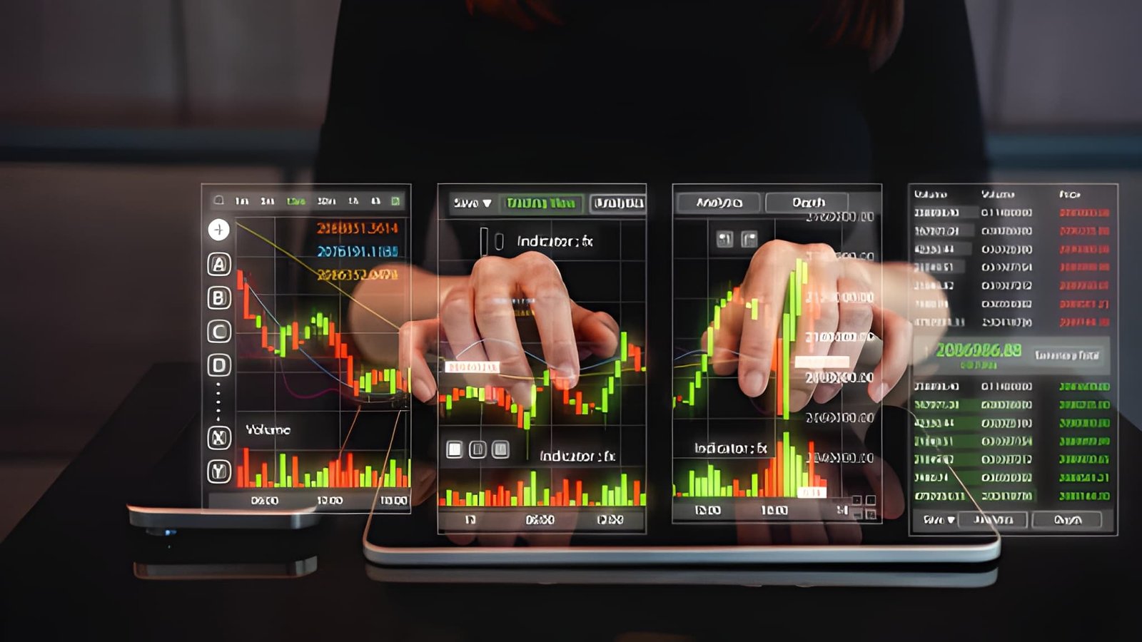
Most market participants reside in one of two distinct silos: the fundamental analyst who obsesses over balance sheets and interest rate decisions, or the technical trader who relies exclusively on price action and candlesticks. However, the elite tier of institutional traders utilizes a hybrid methodology. They treat macroeconomic data as technical inputs. By charting the behavior of yield spreads, currency strength, and credit quality, they gain a structural view of the market that a standard RSI or MACD simply cannot provide.
The Yield Curve Spread (10Y-2Y)
The yield curve represents the graphical relationship between the interest rates of short-term and long-term debt. In a healthy economy, long-term bonds yield more than short-term bonds to compensate investors for the time risk. Technical traders track the 10Y-2Y Spread—the difference between the 10-year Treasury yield and the 2-year Treasury yield. When this spread enters negative territory, known as an inversion, it signals an impending economic contraction with remarkable historical accuracy.
As a technical indicator, the yield curve behaves with recognizable patterns. Traders look for Triple Bottoms or Divergences in the spread. If the S&P 500 continues to make new highs while the 10Y-2Y spread is steeply steepening or flattening, it suggests a lack of confirmation. A flattening curve typically benefits defensive sectors like utilities and healthcare, while a steepening curve provides the "tide" for banking and financial stocks.
Short-term rates rise faster than long-term rates. This signals tightening liquidity and a potential slowdown in growth. Defensive positioning is preferred.
Long-term rates rise faster than short-term rates. This signals expectations for future growth and inflation. Risk-on assets generally thrive.
The US Dollar Index (DXY)
The US Dollar Index (DXY) is the ultimate benchmark for global liquidity. Because the dollar serves as the primary currency for global trade and debt, its strength or weakness directly affects every other asset class. A technical break above a major resistance level on the DXY often acts as a sell signal for commodities and emerging markets. Conversely, a bearish breakdown in the dollar provides the tailwind needed for gold and tech-heavy indices to rally.
Professional traders treat the DXY like a major currency pair. They apply moving averages (50-day and 200-day) to identify the long-term trend. A "Golden Cross" on the DXY is frequently the precursor to a multi-month period of stress for risk assets. By monitoring the dollar's technical health, you can avoid fighting the "Global Dollar Short," which is a primary cause of portfolio drawdowns for retail investors.
Real Yields and the TIPS Factor
Nominal interest rates provide only half of the story. To understand the true cost of money, you must examine Real Yields, which subtract inflation expectations from the nominal yield. Technical traders track the yield on Treasury Inflation-Protected Securities (TIPS). When real yields rise technically, it creates a massive headwind for non-yielding assets like Gold and Bitcoin.
Rising real yields mean that safe, government-backed debt is becoming more attractive on a relative basis. This forces institutional investors to rebalance their portfolios, pulling capital out of speculative high-growth technology stocks and placing it into fixed income. If you see real yields breaking out of a 52-week consolidation, it is a high-conviction signal to reduce exposure to long-duration equities.
The Copper/Gold Ratio
Intermarket ratios provide a visual representation of risk appetite. The Copper/Gold Ratio is perhaps the most famous of these. Copper is an industrial metal used in everything from construction to electronics; it represents economic growth. Gold is a store of value used during times of fear; it represents economic anxiety. When the ratio rises, growth expectations are outpacing fear. When it falls technically, the market is bracing for a downturn.
Traders chart this ratio just like a stock. A technical breakout in the Copper/Gold ratio often confirms a new leg higher in the industrial sector and the broader S&P 500. If the equity market is rallying but the Copper/Gold ratio is making lower highs, the rally is likely a "bull trap" driven by defensive flows rather than genuine economic expansion.
High-Yield Credit Spreads
The health of the credit market is the health of the equity market. Credit Spreads measure the difference between the yield on risky "junk" bonds and safe government bonds. When spreads are narrowing, it indicates that investors are confident and willing to lend money to riskier companies. When spreads "blow out" technically, it signals a sudden withdrawal of liquidity.
| Metric | Technical Signal | Market Interpretation |
|---|---|---|
| High Yield (HYG) | Breaks below 200 SMA | Significant risk-off warning. |
| Credit Spread | Technical Divergence | Early warning of equity volatility. |
| MOVE Index | Sudden Volatility Spike | Bond market instability arriving. |
Financial Conditions Indices
Various organizations, such as the Federal Reserve and Goldman Sachs, compile Financial Conditions Indices (FCI). These indices incorporate interest rates, exchange rates, equity valuations, and credit spreads into a single score. For a macro trader, the FCI is the ultimate technical filter. When financial conditions are tightening, the "win rate" for long technical setups in stocks decreases dramatically.
Charting the FCI allows you to see the "restrictiveness" of the environment. If the Fed is hawkish but the FCI remains loose, the market is effectively ignoring the central bank. This creates a "short volatility" environment. However, once the FCI breaks its uptrend, the resulting tightening usually triggers a rapid repricing of risky assets. Monitoring the Rate of Change (ROC) of the FCI is a primary tool for determining the size of your positions.
The Math of Macro Exposure
Managing a macro-driven portfolio requires a different approach to position sizing. Because macro indicators affect entire asset classes, you must account for systemic correlation. If the US Dollar Index is at a major resistance level, your long positions in EUR/USD, Gold, and the S&P 500 are essentially the same trade. You are trading a "Dollar Short."
Current Risk: 2% of Capital
DXY Correlation: +0.85 (High)
Equity Volatility: 1.2x (ATR adjustment)
Calculation:
Effective Risk = Base Risk * (1 - Correlation Weight)
Macro Exposure Adjustment = $50,000 * 0.02 * (0.15)
Adjusted Macro Risk = $150 per unit
Note: When macro indicators show high correlation, reducing individual unit size prevents a single "Macro Shock" from wiping out multiple trade ideas simultaneously.
The best technical macro indicators are those that reveal the "plumbing" of the financial system. By charting the 10Y-2Y spread, the US Dollar Index, and credit spreads, you stop guessing what might happen and start seeing what is actually happening in the flow of capital. The artisan trader understands that price action is the final result of these underlying macro forces. Mastering these indicators allows you to position yourself with the tide, ensuring that every technical setup you take has the wind of global liquidity at its back.
Technical macro analysis represents the highest form of market mastery. It is descriptive, predictive, and structurally sound. By bridge the gap between economic theory and the visual reality of the chart, you transform from a speculative participant into a sophisticated architect of wealth. The market pulse is hidden in the spreads, the yields, and the dollar strength—your task is simply to learn the rhythm.