The Visual Edge: Selecting the Best Charts for Day Trading Success
A Professional Guide to Choosing the Best Intraday Trading Charts
In the high-velocity world of intraday trading, a chart is not merely a record of past prices; it is a live visual map of human conviction and institutional intent. The "best" chart for any specific trader depends entirely on their strategy, decision-making speed, and ability to process visual information under duress. To succeed, one must move beyond the default settings provided by retail brokers and craft a visual environment that clarifies rather than confuses.
Professional charting serves a single purpose: to identify statistical imbalances in supply and demand. Whether you prefer the granular intensity of tick charts or the smoothed elegance of Heikin-Ashi, the objective remains constant—spotting the moment when one side of the market yields to the other. This guide analyzes the structural merits of various charting styles to help you refine your visual edge.
A standard candlestick chart provides approximately four times the data of a simple line chart for the same period. This increased density allows traders to identify price rejection and exhaustion levels that remain invisible on less sophisticated visual representations.
Candlestick Dominance
The Japanese candlestick remains the undisputed standard for day trading. Its success lies in its ability to show the "battle" within a specific time interval. The relationship between the body (the open-to-close range) and the wicks (the high/low extremes) tells a story of who controlled the auction.
Day traders prioritize candlesticks because they offer immediate visual cues for reversals. A "Hammer" or "Shooting Star" provides an instant signal of price rejection at a specific level, allowing for tight stop-loss placement. When looking for the best charts, the ability to read these individual stories within a larger trend is fundamental to risk management.
Filtering Noise with Heikin-Ashi
Traditional candlesticks are often "noisy," frequently alternating between red and green in a way that can trigger emotional exits. Heikin-Ashi charts solve this by using an averaging formula for the open, high, low, and close of each candle.
The result is a chart where trends appear much smoother. In a strong uptrend, Heikin-Ashi candles typically remain green and lack lower wicks. For traders who struggle with "over-trading" or exiting positions too early, this chart style acts as a powerful psychological stabilizer, highlighting the primary trend direction while filtering out minor intraday oscillations.
Provide the exact price data for every interval. Essential for precise entries and identifying exact support/resistance touches.
Provide a mathematical trend representation. Superior for staying in winning trades and identifying momentum shifts.
Tick Charts vs. Time-Based Charts
Most retail traders use time-based charts (1-minute, 5-minute, etc.). However, time is an arbitrary constant that does not always reflect market activity. On a slow lunch hour, a 1-minute candle might represent only ten transactions, while at the market open, it might represent ten thousand.
Tick charts ignore time entirely. A "1000-tick" chart creates a new candle every time 1,000 trades occur. This creates a chart that moves faster when the market is active and stands still when the market is quiet. This is widely considered the "best" chart for scalpers because it highlights volatility and "true" breakouts that time-based charts often obscure.
High Volatility: Use tick charts during the market open (9:30 AM EST) to see micro-pullbacks that are buried inside a single 1-minute candle.
Breakout Confirmation: If a price level breaks on a time chart but volume is low, a tick chart will often show a "slow" formation, signaling a likely fake-out.
Scalping: Tick charts provide more "tradeable" candles per hour during active periods, offering more entry signals with defined risk.
Timeframe Configurations
Even the best chart type fails without proper context. Professional day traders utilize Multi-Timeframe Stacking. This involves looking at a "parent" chart for trend direction and a "child" chart for entry timing.
| Trading Style | Context Chart | Entry Chart |
|---|---|---|
| Scalping | 5-Minute / 15-Minute | 1-Minute / 2000-Tick |
| Trend Following | 60-Minute / Daily | 5-Minute / 15-Minute |
| Reversal Trading | 15-Minute / 30-Minute | 2-Minute / 5-Minute |
Renko and Point-and-Figure
For those who want to strip away both time and minor price fluctuations, Renko charts offer a "brick" based view. A new brick is only drawn when price moves a specific distance (e.g., 50 cents). This creates a exceptionally clean chart where trends are unmistakable.
Similarly, Point-and-Figure charting focuses solely on price reversals. These styles are often used by long-term day traders to identify major support and resistance zones that have stood the test of multiple days or weeks, serving as the ultimate "anchor" for an intraday strategy.
Essential Technical Overlays
A chart without overlays is a map without landmarks. While "clean" trading is a virtue, certain indicators are considered essential baseline requirements for professional intraday charting.
- VWAP (Volume Weighted Average Price): The most important chart overlay for day traders. It shows the true average price paid by all participants during the session.
- EMA (Exponential Moving Averages): Specifically the 9-period and 20-period EMAs. These act as dynamic support and resistance levels on the 5-minute chart.
- Relative Volume (RVOL): Not a price overlay, but a necessary sub-chart to identify if a price move is backed by institutional conviction.
// Using ATR (Average True Range) to set stops
Current Price: 450.25
ATR (14 period on 5m chart): 0.75
Conservative Stop = Price - (2 * ATR)
Stop Level = 450.25 - 1.50 = 448.75
// Ensure this level aligns with a structural chart support.
Managing Cognitive Load
A common trap for new traders is "Indicator Soup"—cluttering the chart with so many lines and oscillators that the actual price action is obscured. This leads to analysis paralysis. The best charts are often the ones with the least amount of "clutter."
Professionals often use a high-contrast color scheme (white background, black/white candles or dark theme) to reduce eye strain. Every element on your chart must earn its place. If an indicator does not directly influence your entry or exit decision, it should be removed to free up mental bandwidth for observing volume and price speed.
Hardware and Platform Standards
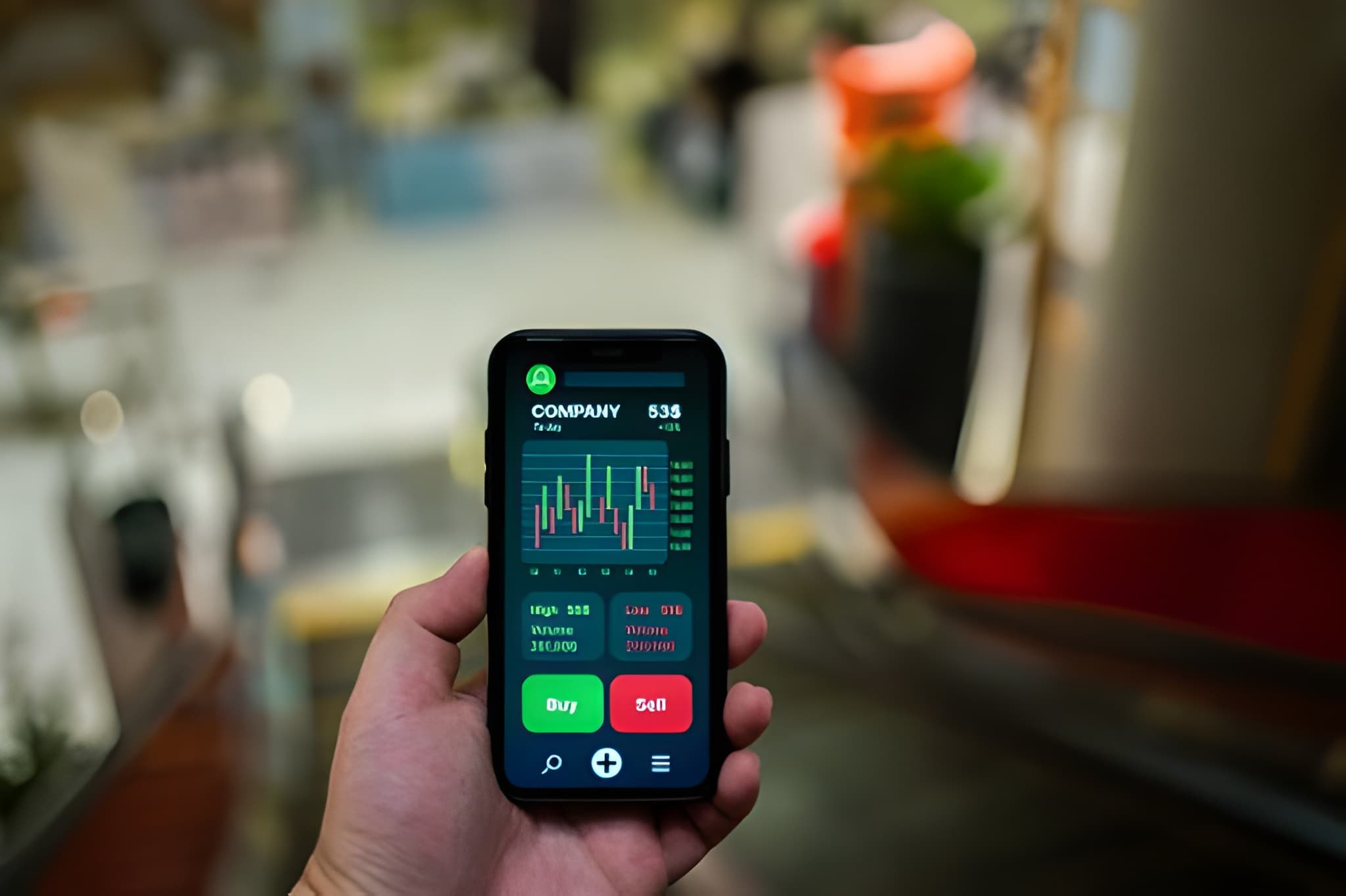
The software you use to view these charts is just as important as the charts themselves. Day trading requires real-time, non-lagging data. Retail platforms often "throttle" data to save bandwidth, which can be disastrous for a scalper using a 1-minute chart.
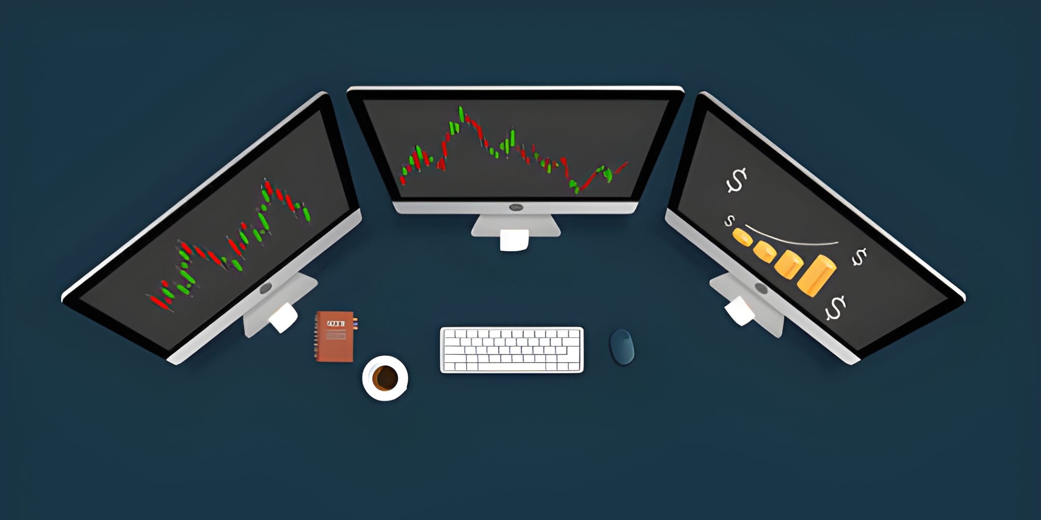
Professional platforms like TradingView, Thinkorswim, or Sterling Trader Pro allow for "Hardware Acceleration," utilizing your computer's GPU to render charts smoothly. For serious day traders, a multi-monitor setup is standard—one screen for market-wide scanning and another for dedicated multi-timeframe analysis of a single ticker.
Strategic Selection Synthesis
There is no universal "best" chart, but there is a best chart for you. If you find yourself panicked by every small tick against you, transition to Heikin-Ashi. If you feel you are "too late" to every move, move to a Tick chart.
The ultimate charting setup is one that you can interpret in less than three seconds. When you look at your screen, the trend, the key levels, and the current momentum should be immediately obvious. Over-complication is the enemy of execution.
As the markets continue to digitize in , your visual edge will remain your most valuable asset. Master your tools, clean your workspace, and let the price action speak for itself.