Mastering Candlestick Charts for Day Trading
An Expert Guide to Decoding Market Sentiment, Visualizing Price Action, and Identifying High-Probability Patterns
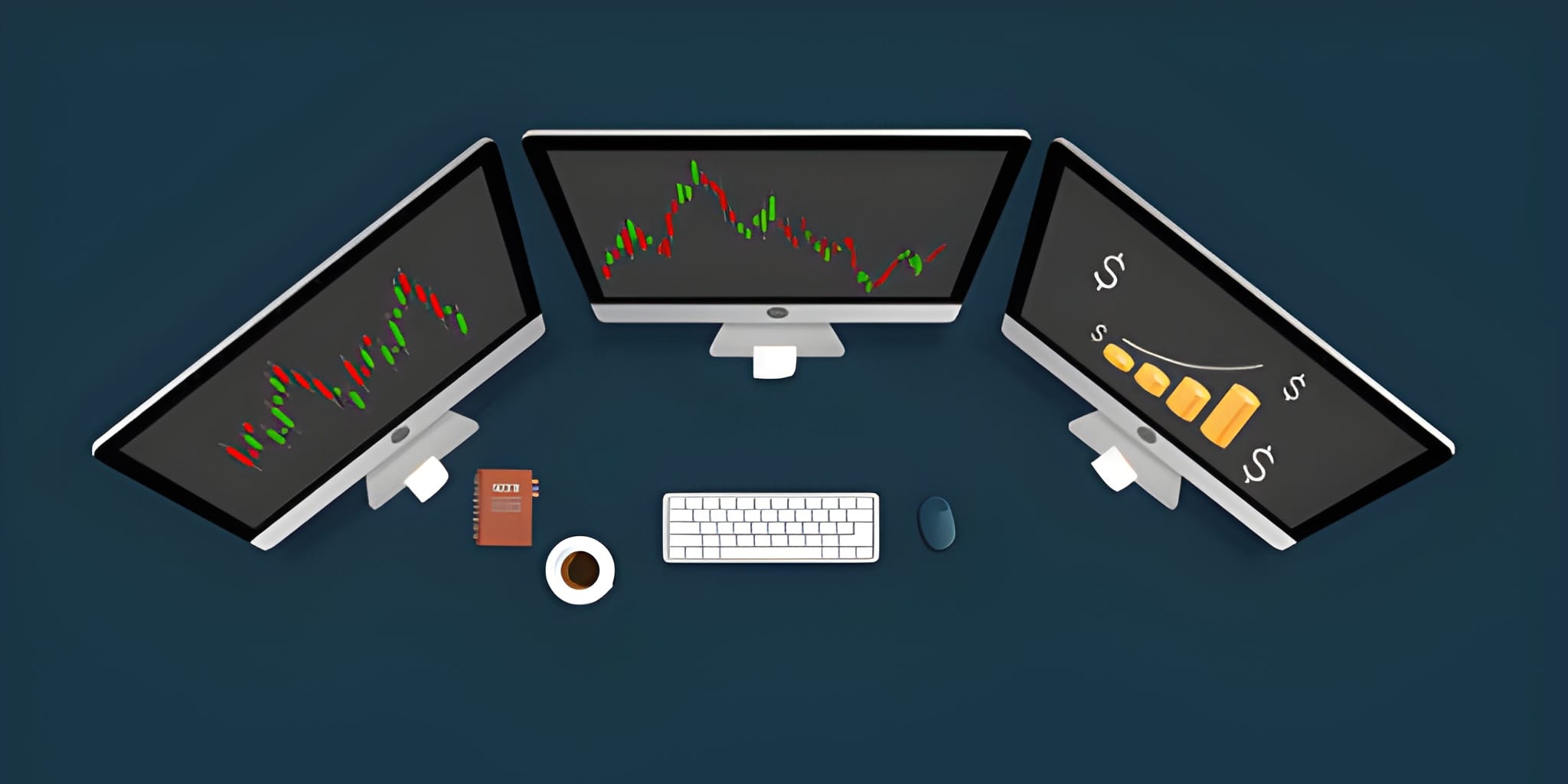
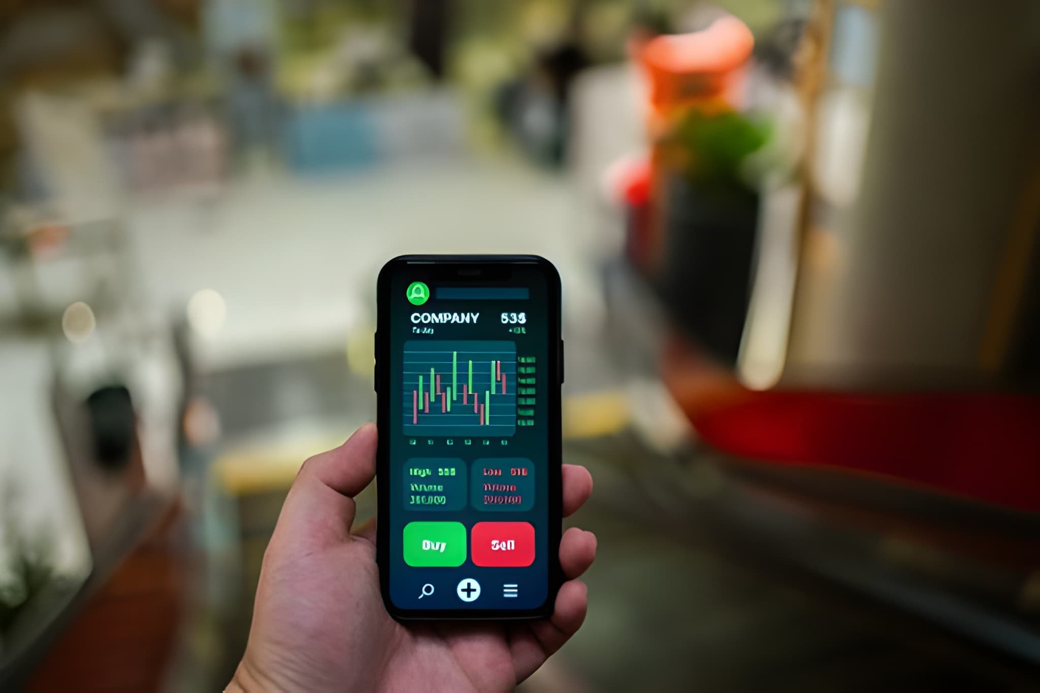
In the high-velocity environment of day trading, price is the only truth. While lagging indicators like moving averages or RSI provide useful context, they are ultimately derivatives of price action. Candlestick charts, a method of visualizing price developed by Japanese rice traders in the 1700s, remain the most powerful tool for a modern day trader. They provide a visual representation of the constant tug-of-war between buyers (bulls) and sellers (bears), revealing not just where the price is, but how it got there and where it is likely to go next.
Reading a chart is more than just memorizing shapes; it is about interpreting the story of the market. Every candle represents a specific period—whether one minute, five minutes, or an hour—and encapsulates the collective emotions of every participant in the market during that time. Understanding these visuals allows a trader to identify entry points, set stop losses, and take profits with surgical precision.
The Anatomy of a Candlestick
To read a chart, you must first understand the four data points every candle provides: the Open, High, Low, and Close (OHLC). These four points create the structure of the candle, consisting of a Real Body and Wicks (also known as shadows or tails).
- The Real Body: The thick part of the candle representing the range between the open and the close.
- The Upper Wick: The vertical line above the body, showing the highest price reached.
- The Lower Wick: The vertical line below the body, showing the lowest price reached.
In day trading, the color of the body tells you the immediate direction. On most platforms, a green (or hollow) candle signifies that the closing price was higher than the opening price. A red (or solid) candle means the price closed lower than it opened.
Body Size = Absolute Value of (Close - Open)
Bullish vs. Bearish Sentiment
Sentiment analysis is the core of reading candles. A large green body indicates strong buying pressure, suggesting that bulls are in full control. Conversely, a large red body indicates that bears are aggressively pushing the price down.
The Marubozu
A candle with a large body and almost no wicks. It represents total dominance by one side from start to finish. In day trading, a bullish Marubozu breaking through resistance is a high-conviction signal.
The Doji
A candle where the open and close are nearly identical, creating a cross-like shape. This signals indecision. The market is at a stalemate, often preceding a significant move or reversal.
Key Reversal Patterns
Day traders look for reversals to catch the beginning of a new trend. Reversal patterns often occur at established levels of support or resistance.
1. The Hammer and Hanging Man
The Hammer is characterized by a small body at the top of the range and a long lower wick (at least twice the size of the body). When found at the bottom of a downtrend, it suggests that sellers tried to push price lower but were violently rejected by buyers.
2. The Engulfing Pattern
This is a two-candle pattern. A Bullish Engulfing occurs when a small red candle is followed by a much larger green candle that completely "swallows" or covers the range of the previous candle's body. It signals a sudden and powerful shift in momentum.
| Pattern Name | Type | Meaning for Day Traders |
|---|---|---|
| Hammer | Bullish Reversal | Bottom is near; buyers are stepping in. |
| Shooting Star | Bearish Reversal | Top is near; sellers rejected higher prices. |
| Engulfing | Momentum Shift | Strong takeover by the opposing side. |
| Morning Star | 3-Candle Bullish | Downtrend exhausting, new uptrend beginning. |
Continuation Signals
Not every signal is a reversal. Often, candles tell you to stay in your trade because the trend is still healthy.
Multi-Timeframe Analysis
A single candlestick on a 1-minute chart only tells a tiny part of the story. Successful day traders use multi-timeframe analysis to increase their accuracy. If you see a bullish Hammer on a 5-minute chart, you should check the 15-minute or 1-hour chart to see the overall trend.
The Psychology of the Wick
If the body is the "real" action, the wicks are the "rejected" action. This is where the true psychology of day trading lies. A long upper wick indicates Price Rejection. The price went up, participants decided it was too expensive, and they sold it back down.
When you see multiple long upper wicks at a specific price level, the market is telling you that there is a "ceiling" or resistance there. For a day trader, this is a signal to stop buying or to consider a short position.
Integrating Volume & Context
Reading candles in isolation is a recipe for failure. To truly master the chart, you must add Context and Volume.
The Power of Volume Confirmation
A bullish engulfing candle on low volume is suspicious; it lacks the conviction of the broad market. However, a bullish engulfing candle accompanied by a massive spike in volume is a "high-probability" signal. It means large institutional players are likely entering the trade.
Location, Location, Location
A candlestick pattern is only as good as its location. A Hammer in the middle of a choppy, sideways range is meaningless. A Hammer that touches a major historical support level or a 200-period moving average is a professional-grade setup.
- Identify the overall trend on a higher timeframe.
- Wait for price to reach a key area (Support/Resistance).
- Look for a specific candlestick reversal or continuation pattern.
- Confirm the move with an increase in trading volume.
- Calculate your Risk-to-Reward ratio before clicking "Buy".
Mastering candlestick charts takes time and thousands of hours of observation. Start by focusing on just two or three patterns—like the Hammer and the Engulfing—and observe how they behave at support and resistance levels. By focusing on the story the wicks and bodies are telling you, you move beyond "guessing" and start trading based on the actual mechanics of supply and demand.