Mastering the Clock: Choosing the Optimal Candlestick Timeframe for Day Trading
The timeframe you choose to trade is as critical as the strategy itself. It dictates the frequency of your signals, the amount of market noise you filter, and the level of psychological stress you must endure.
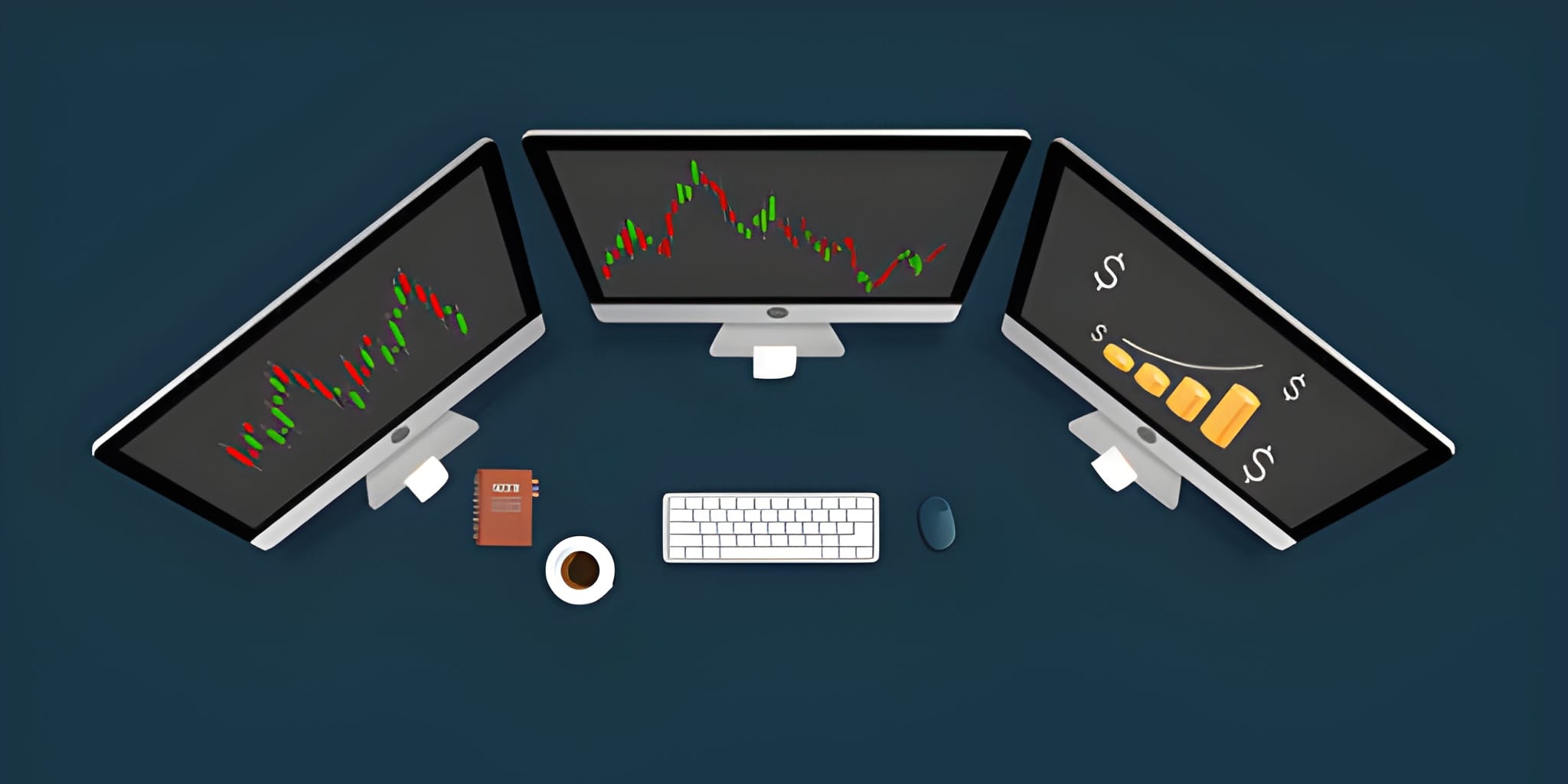
Strategic Guide Map
The Relativity of Time in Trading
Candlestick charts do not show price; they show the history of price action within a fixed container of time. A single 1-hour candle contains the data of twelve 5-minute candles or sixty 1-minute candles. This fractal nature means that a bullish trend on a 1-minute chart might simply be a small pullback on a 15-minute chart.
Choosing a timeframe is an exercise in balancing granularity and reliability. Lower timeframes provide more trading opportunities but subject the trader to significant market noise. Higher timeframes filter this noise but offer fewer entries and require wider stop-losses to accommodate the larger price swings. A professional approach involves aligning the timeframe with your specific trading style, account capital, and emotional temperament.
Micro-Scales: The 1 and 2 Minute Charts
The 1-minute and 2-minute charts are the domain of the scalper. These timeframes allow for surgical entries and extremely tight stop-losses, often measuring only a few cents or ticks. Traders using these scales are looking to capture small momentum bursts that last for just a few minutes.
Highest frequency of signals. Allows for very small risk-per-trade in dollar terms. Ideal for high-volatility events like earnings releases.
High levels of market noise. Commissions and slippage eat a larger portion of profits. Requires constant focus and rapid reflexes.
On these micro-scales, Execution Speed is the primary differentiator. If you are trading a 1-minute Hammer, you cannot afford a 3-second delay in your order execution. By the time you enter, the price may have already moved past your target. Furthermore, patterns on these charts are frequently invalidated by institutional "sweeps" or algorithmic noise that doesn't reflect a true change in market sentiment.
The Sweet Spot: 5 and 15 Minute Charts
Most professional intraday swing traders consider the 5-minute and 15-minute charts to be the optimal balance. These timeframes are slow enough to filter out the random fluctuations of high-frequency algorithms but fast enough to provide multiple trade opportunities during a single session.
The 5-minute chart is widely recognized as the industry standard for day trading execution. It aligns perfectly with the rhythm of the market open and the mid-day lull. The 15-minute chart is often used to confirm the "intermediate" intraday trend and identify strong areas of supply and demand that are likely to hold during a test.
| Timeframe | Typical Hold Time | Trading Style | Best Indicator Alignment |
|---|---|---|---|
| 1-Minute | 10s - 3m | Pure Scalping | Level 2 / Time & Sales |
| 5-Minute | 15m - 2h | Standard Day Trading | VWAP / 9 EMA |
| 15-Minute | 1h - End of Day | Intraday Swing | 20 EMA / Previous Day High |
| 60-Minute | All Day / Multiday | Trend Identification | 50 SMA / Daily Pivot |
Multi-Timeframe Matrix Techniques
Success in day trading is rarely found on a single screen. Professional traders utilize a Top-Down approach to ensure their trade aligns with the broader market force. This technique involves using three distinct layers of time: the Anchor, the Context, and the Execution.
1. The Anchor (60-Minute or Daily)
The anchor timeframe tells you the overall "weather" of the stock. Is it a trending day or a ranging day? You use this to identify the path of least resistance. If the Daily chart shows a breakout above a 6-month resistance level, you should be biased toward long positions only.
2. The Context (15-Minute)
The context timeframe identifies the intraday structure. It shows you the key support and resistance levels for the current session. You look for patterns on this timeframe to form your trade thesis (e.g., "I will buy if the 15-minute chart holds the VWAP").
3. The Execution (2-Minute or 5-Minute)
This is where you pull the trigger. Once your anchor and context align, you zoom in to the execution timeframe to find the perfect candlestick entry, such as an Engulfing pattern or a Bull Flag, that offers a tight risk-to-reward ratio.
Higher Timeframe (15m) ATR: $1.20
Lower Timeframe (2m) ATR: $0.15
If you trade the 2m chart, your stop-loss is tight. If you trade the 15m chart, your stop-loss must be wider. Always ensure your position size is adjusted so that the dollar risk remains constant regardless of the timeframe chosen.
Noise vs. Signal: The Fractal Reality
Market noise refers to price movements that have no underlying fundamental or psychological cause. On a 1-minute chart, a large red candle might be caused by a single small institution rebalancing a minor position. This is "noise" because it doesn't represent a change in the market's collective mind.
On a 60-minute chart, that same red candle would take sixty minutes of sustained selling to form. This is a "signal" because it requires a persistent effort from large-scale sellers. As you move up the timeframe ladder, the Signal-to-Noise Ratio improves. This is why many novice traders find more success when they move from the 1-minute chart to the 5-minute or 15-minute charts; they are simply reacting to more reliable information.
Asset-Specific Temporal Logic
Not all assets move at the same speed. The optimal timeframe for a low-float penny stock is vastly different from that of a blue-chip index like the S&P 500.
These stocks move so quickly that a 15-minute candle could contain the entire move from $2 to $10. For these assets, the 1-minute and 2-minute charts are necessary. A 5-minute chart is often too slow to capture the parabolic breakouts and subsequent "rug pulls" common in this sector.
These assets are dominated by institutional algorithms and high-frequency traders. They respect technical levels with high precision. The 5-minute and 15-minute charts are the gold standard here. The 1-minute chart in these assets is often so full of "whipsaws" (fakeouts) that it becomes a liability for the retail trader.
Futures markets are extremely liquid and operate nearly 24/7. Because of the sheer volume, many futures traders use Tick Charts or Range Charts rather than time-based candles. If you must use time, the 5-minute and 15-minute are best for identifying major institutional "pivot" levels.
The Psychological Toll of Fast Candles
Every time a candle closes, your brain receives a new piece of information that triggers a chemical response. On a 1-minute chart, you are processing sixty "shocks" to your system every hour. This leads to decision fatigue, a state where your ability to make rational choices deteriorates as the day progresses.
Many traders start the day profitably on the 1-minute chart but give all their gains back by lunch because they have exhausted their mental energy. By moving to a 5-minute or 15-minute chart, you reduce the frequency of these mental shocks. You give yourself time to breathe, analyze, and wait for high-quality setups. In the profession of trading, patience is often more profitable than speed.